Tuesday, July 24, 2012

Historical Maps


Historical maps are maps that represent an area or region in the way that it was perceived in times past. The above example is a medieval map of not only the perceived world, but the weather and the cosmos as well. The way the world was mapped back then by certain people is valuable evidence in map analysis. The incredible detail in medieval maps made them works of art by the accredited cartographers.
Lorenz Curve

Picture

The Lorenz Curve is a graphical method used to display the concentration of activities within an area. The Lorenz Curve above shows the distribution of wealth in two different countries, as compared to a line of perfectly equal distribution. That line is an ideal used as a comparison for real-world values. In a perfectly even distribution of wealth, 60% of the cumulative population would control 60% of the cumulative wealth. In the above example, 60% of the population controls only 20% of the wealth. This graphing method could provide information that would be useful in geography and cartography.

Triangular Plot


A triangular plot is a type of graph that shows three different variables within a single triangle. Data is normally organized in this way for the sake of comparison. The triangular plot above shows the soil composition of an area with soil made up of primarily clay, silt, and sand. Most often, these plots are used in geologic studies to show the relative compositions of soils and rocks. However, it can be used to graph any system with three variables.

Correlation Matrix


A correlation matrix is a matrix giving the correlations between all pairs of data sets. The example above shows the correlation matrix for Phage T7 Proteins. Red indicates high correlation and blue indicates low correlation. Red is pinned to a value of 1, which means perfect correlation in statistics, whereas blue approaches 0, meaning no correlation in statistics. This could be used to determine correlation between geographic phenomena. 

Similarity Matrix


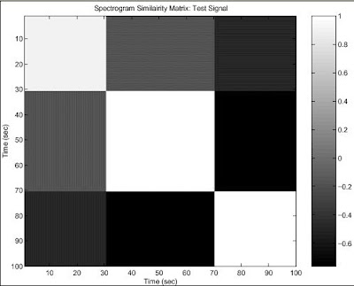
A matrix is defined as a rectangular array of numbers, symbols, or expressions, arranged in rows and columns. A similarity matrix shows how close two data points are based on a matrix of scores. This similarity matrix above is for a two test signal. The white squares represent high amounts of similarity.

Stem and Leaf Plot


Stem and leaf plots are yet another way of visually representing the distribution of data. The data is divided so that the "leaf" (last digit) of a value is grouped with other "leaves" from the same "stem" (the second to last digit). When displayed graphically in this way, it is easy to find the mean, median, and mode of the data, as well as make any observations about the way it is distributed. In the example of a stem and leaf plot above, the distribution of adult heights (out of a 200 person sample) is shown. The majority of the people accounted for fall between 62 and 72 inches tall. There is a spike at 67 and 68 inches tall, suggesting that the average height of all people in that region would be close to one of those values. Stem and leaf plots can be very useful tools in plotting the distribution of spatial data. 

Box Plot


Box plots are another statistical representation of data. They are useful for visually representing the maximum, minimum, upper quartile, lower quartile and median of the data. The boxes are based on the standard deviation of the data. The example of a box plot above compares the salaries of an engineer and a person working in marketing through the use of box plots. Clearly the median salary of someone working in marketing is higher than that of an engineer. These plots can be very useful for plotting spatial data too.

Histogram


Histograms are bar graphs without any space left between bars. They plot the frequency of a particular variable. The histogram above represents the frequency distribution of the heights of 25 students. The most common heights out of the 25 students were 62-64 inches and 64-66 inches. None of the students measured were under 58 inches tall. Histograms such as these are useful for organizing spatial data for mapping.

Wind Rose


A wind rose is a geographic representation of wind speed and wind direction for a particular location over a specified period of time. The frequency of winds blowing from each direction is also shown. In the wind rose for Raleigh-Durham Airport in North Carolina, shown above, there are 16 spokes which represent possible directions that the wind comes from. It is observed that winds coming from west-southwest are the most frequently occurring. Severe winds are not common in this location, which is a very good quality for an airport to have. 

Climograph


Climographs organize data for temperature and precipitation in a region in a way that allows for easy visualization of both variables. The graph spans a whole year, so that annual trends can be seen. Rainfall is represented by a parabola, whereas temperature is represented by the bars beneath the curve. The above example of a climograph is based on the climate of Anchorage, Alaska. Conclusions can be made that the summer season sees the highest rate of precipitation and the late summer to fall seasons see the highest average temperatures in Alaska.

Population Profile


Population profiles, sometimes called population pyramids, are graphic representations of national population data. The name "population pyramid" likely came from the way these profiles look for developing countries whose base of young boys and girls is very large compared to its population of elderly people which is likely very small due to lower life expectancy. The population profile of developed countries take on a different form though, as children become financial burdens rather than assets and people live longer due to better access to medicine and healthcare. The population profile of Germany, seen above, shows the trend of negative population growth in the country, with less young people than middle-aged people. These profiles can be useful tools in a variety of fields.

Scatter Plot


Scatter plots can be used to represent geographic information. They show the relationship between two variables, with one variable pinned to the x-axis and the other pinned to the y-axis. Scatter plots are used in statistics and geography alike. They are useful for determining correlation between the two variables. In the scatter plot above, there is positive correlation between husbands' ages compared to wives' ages. These scatter plots might also show weak correlation or no correlation at all.

Weather Forecasting Map


Weather forecast maps are in a sense a combination of various map types, but also a simplification of various map types. The actual process of mapping the weather is complex and requires a great deal of information. However, it must be shown in a way that's easy to view quickly for a forecast. The map above is from The Weather Channel and represents the sweeping weather trends across the United States. High pressure systems and low pressure systems, in addition to cold fronts and warm fronts are the focus of this map. Isobars are shown, but no values are shown with them, so they are not very useful. Patches of precipitation are also shown here. These types of maps are used for people to figure out what type of weather to expect in their region or other regions that they may be traveling to.

Bilateral Graph


Bilateral graphs represent two variables that are correlated. They allow the reader to see more than one set of data at once. The variables may overlap each other, however the map above does not show that. It represents Census data of total retail sales in the USA over the span on 11 days. The variable underneath that represents the total retail sales excluding the sale of gasoline. The resulting bilateral graph shows that as more money is spent in the retail sector of the economy, a directly proportional increase in gasoline sales results. 

Nominal Area Choropleth Map


Nominal area choropleth maps are choropleth maps that use nominal data, so there is no ranking system for the different categories of data. Rather, nominal data is descriptive of the spatial data that is being plotted. The map above, for example, plots the minority group with the highest percent of population for each US state. This does not communicate numerical values, but gives the reader a general idea about the makeup of state populations. It is clear that Hispanics dominate as the largest minority in the western states and blacks dominate as the largest minority in the whole eastern USA. 


Multivariate Map


Multiple mapping techniques are combined in one map with multivariate maps. In the map above, the household vacancies in Idaho's counties are shown by proportional circles and the population densities of the counties are shown using the choropleth technique. This allows the reader to observe if any correlation between variables exists. Multivariate maps could compare more than two variables too. 

Unstandardized Choropleth Map


Unstandardized choropleth maps are thematic maps that display data sets as raw numbers. The data are represented by their original value, instead of being averaged. They do not use data based on percentages. The map above shows the distribution of churches of eight different denominations of Christianity across the United States. The data is represented for each county in the USA. The Baptist denomination in the southern states is a large concentration of the same denomination in one region, while the Catholic faith is quite pervasive throughout the country.

Standardized Choropleth Map


Standard choropleth maps assign the data used in choropleth maps to a specific region or area. The data is divided so that a pattern of distribution can be observed. In the above map, the population per square kilometer is shown, with the area broken up into counties. Upon first viewing, the reader immediately notices the areas of dense population.

Univariate Choropleth Map


Univariate choropleth maps show only one variable distributed across an area or region. The above map plots the differences in terms used to say "soda" across the United States. While much of the country calls those fizzy drinks "pop," it is also called "coke" more in the South, just "soda" in certain areas, and some places have made up their own unique terms for soda. The map shows just this one variable on a map of the USA in choropleth map form. 

Bivariate Choropleth Map


Bivariate choropleth maps represent two different variables o the same map. The map above represents both people per square mile in 1990 and percent change in population 1990 to 2000 on a map of the mid-Atlantic United States. Three different sets of colors are combined in the legend to make visualization of these two likely-correlated values clearer.