Tuesday, July 24, 2012

Historical Maps


Historical maps are maps that represent an area or region in the way that it was perceived in times past. The above example is a medieval map of not only the perceived world, but the weather and the cosmos as well. The way the world was mapped back then by certain people is valuable evidence in map analysis. The incredible detail in medieval maps made them works of art by the accredited cartographers.

Lorenz Curve

Picture

The Lorenz Curve is a graphical method used to display the concentration of activities within an area. The Lorenz Curve above shows the distribution of wealth in two different countries, as compared to a line of perfectly equal distribution. That line is an ideal used as a comparison for real-world values. In a perfectly even distribution of wealth, 60% of the cumulative population would control 60% of the cumulative wealth. In the above example, 60% of the population controls only 20% of the wealth. This graphing method could provide information that would be useful in geography and cartography.

Triangular Plot


A triangular plot is a type of graph that shows three different variables within a single triangle. Data is normally organized in this way for the sake of comparison. The triangular plot above shows the soil composition of an area with soil made up of primarily clay, silt, and sand. Most often, these plots are used in geologic studies to show the relative compositions of soils and rocks. However, it can be used to graph any system with three variables.

Correlation Matrix


A correlation matrix is a matrix giving the correlations between all pairs of data sets. The example above shows the correlation matrix for Phage T7 Proteins. Red indicates high correlation and blue indicates low correlation. Red is pinned to a value of 1, which means perfect correlation in statistics, whereas blue approaches 0, meaning no correlation in statistics. This could be used to determine correlation between geographic phenomena. 

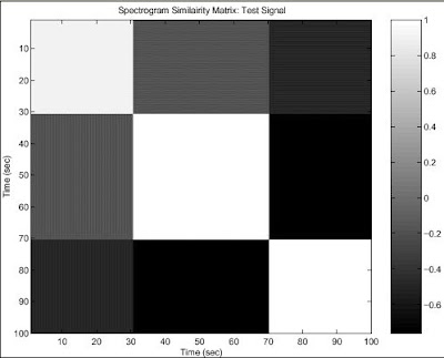
Similarity Matrix


A matrix is defined as a rectangular array of numbers, symbols, or expressions, arranged in rows and columns. A similarity matrix shows how close two data points are based on a matrix of scores. This similarity matrix above is for a two test signal. The white squares represent high amounts of similarity.

Stem and Leaf Plot


Stem and leaf plots are yet another way of visually representing the distribution of data. The data is divided so that the "leaf" (last digit) of a value is grouped with other "leaves" from the same "stem" (the second to last digit). When displayed graphically in this way, it is easy to find the mean, median, and mode of the data, as well as make any observations about the way it is distributed. In the example of a stem and leaf plot above, the distribution of adult heights (out of a 200 person sample) is shown. The majority of the people accounted for fall between 62 and 72 inches tall. There is a spike at 67 and 68 inches tall, suggesting that the average height of all people in that region would be close to one of those values. Stem and leaf plots can be very useful tools in plotting the distribution of spatial data. 

Box Plot


Box plots are another statistical representation of data. They are useful for visually representing the maximum, minimum, upper quartile, lower quartile and median of the data. The boxes are based on the standard deviation of the data. The example of a box plot above compares the salaries of an engineer and a person working in marketing through the use of box plots. Clearly the median salary of someone working in marketing is higher than that of an engineer. These plots can be very useful for plotting spatial data too.